Latest
Visualizing DataFusion physical plans
 Try Plan Visualizer
If you work with DataFusion, you know the drill. Optimization starts with EXPLAIN. Then you slog through the indented tree, trying to follow sort order and parallel execution across operators. I used to redraw those plans in Excalidraw just to see them, explain them, and share them — I onboard newcomers, and walking through a plan is a lot easier when it is a picture. It was time-consuming. There had to be a better way.
Last staycation I started automating the drawing, half because I needed it at work and half for fun. I am a backend person. I did not know much about frontend tools. AI agents did a lot of the UI work I would not have shipped on my own, but I still had to explain what each operator does — and sketch how it should look — before they could draw it.
That first year I only finished the operators I actually used. This staycation I finished the rest of DataFusion’s physical plan. I did not have to describe each new operator, or sketch it first: the models had gotten better, and last year’s drawings were enough for them to figure out how the new ones should look. Checking those drawings taught me operators I rarely use, and a few I had only read about.
Plan Visualizer is the app (try it out). plan-viz is the library underneath.
Paste, click, see the plan
- Paste your physical plan or full
EXPLAINoutput — or pick a sample. - Click Visualize.
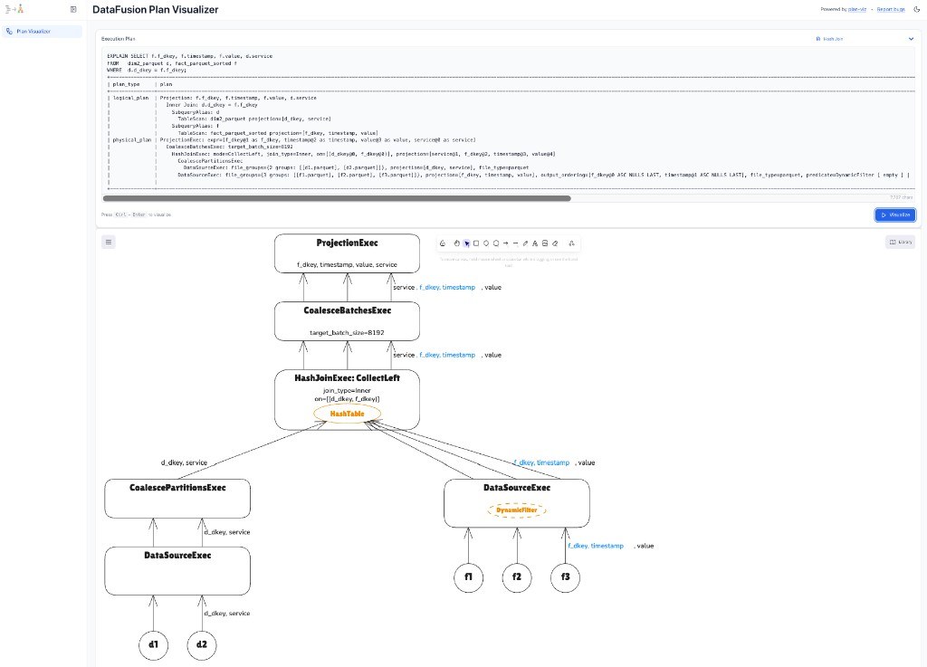
The indented tree becomes an Excalidraw diagram. Color and arrows are the point: they show sort order and parallel streams, and how those properties flow through the plan. You can see whether filters and projections were pushed down, how many streams run at each operator, and whether the sort order you care about survived. The useful part is the break: the diagram pinpoints where parallelism or ordering is lost, which is usually where the bottleneck is.
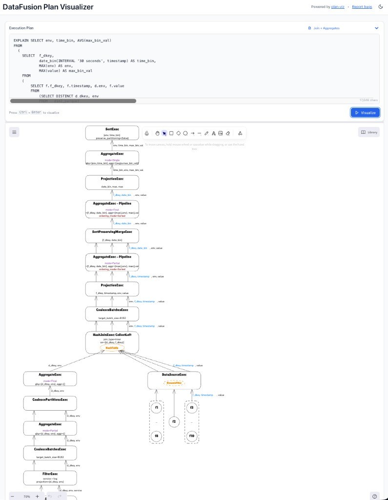
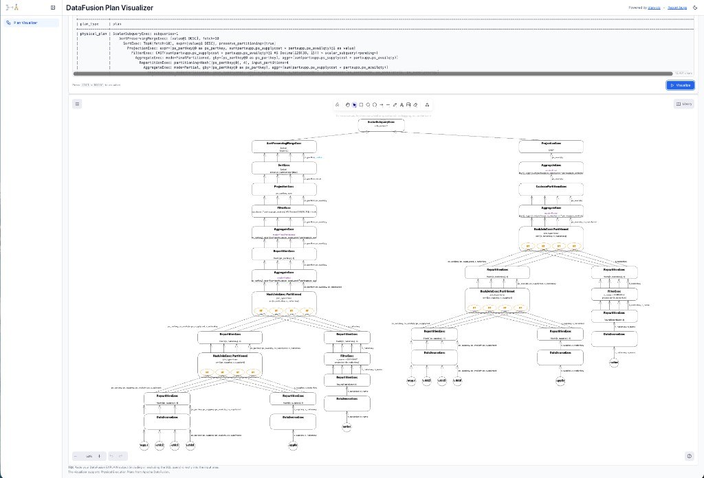
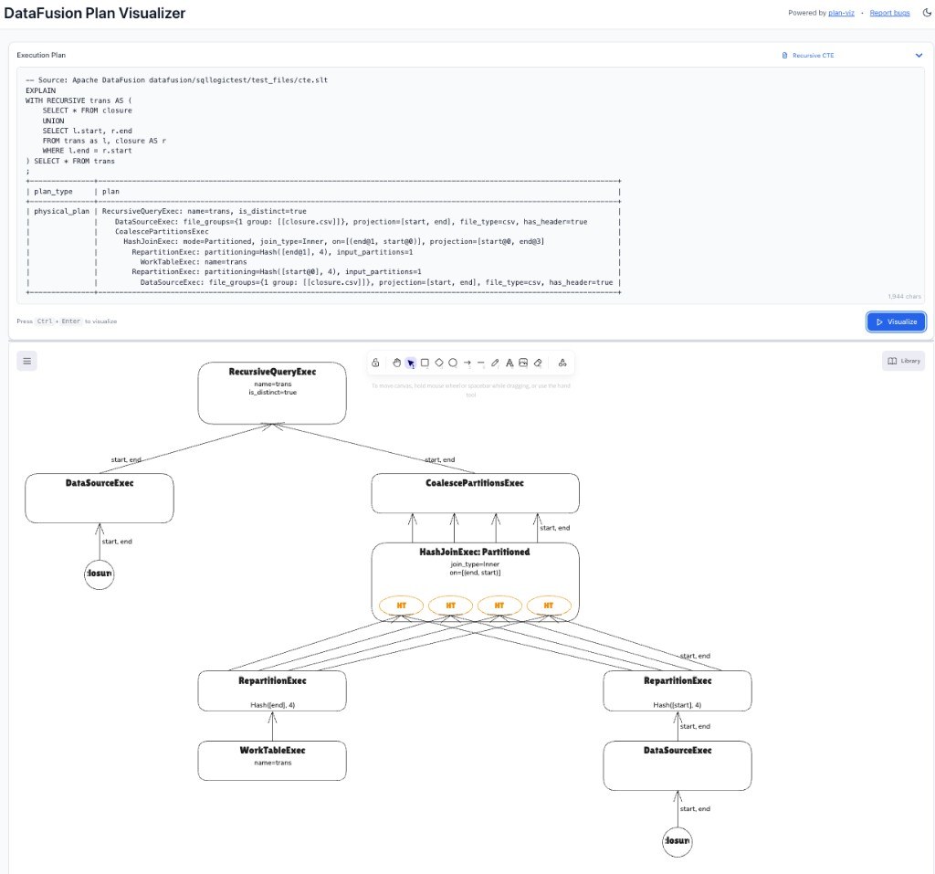
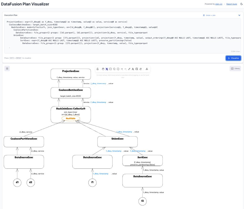
The diagram is editable. Export PNG or SVG for a doc. Open the JSON on excalidraw.com if you want to annotate it with someone else. The app also works offline. More examples — TPC-H Q11, a simple join, a recursive CTE, a union plus join, and scalar subqueries — are at the end of this post. They are samples in the app if you want to try them yourself; the app has others too.
Use the library in your own UI
The web app is a thin wrapper around plan-viz. If you want the same conversion in your own tool:
import { convertPlanToExcalidraw } from "plan-viz";

const executionPlan = `
ProjectionExec: expr=[id, name, age]
  FilterExec: age > 18
    DataSourceExec: file_groups={1 groups: [[data.parquet]]}
`;

const excalidrawJson = convertPlanToExcalidraw(executionPlan);
npm install plan-viz. Usage and examples live in the plan-viz README.
What’s next
I still want to support distributed plans, and better navigation when a plan has hundreds of operators — smart zoom, filtering, collapsible subtrees. I would also like to bring the DataFusion CLI and the Distributed DataFusion CLI into the app, so you can create tables, set sort order and partitioning, run a query, and see the plan right here — enough for an early POC. That loop is a frequent job of mine: find the best plan for a query, and whether DataFusion or Distributed DataFusion should support something so my queries run better. The current drawing already looks good, but it can be better. If you have feedback on how a plan should look, or want to contribute, the drawing layer is a good place to start. AI agents make that less painful than it used to be, but I would rather not do it alone. Contributions are welcome on plan-viz and plan-visualizer.
Thanks to Datadog for the kind of work that made me think about this useful tool. Try Plan Visualizer with the sample plans in the app, or paste in your own.
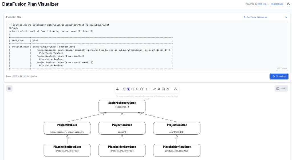
Here are a few other plan shapes